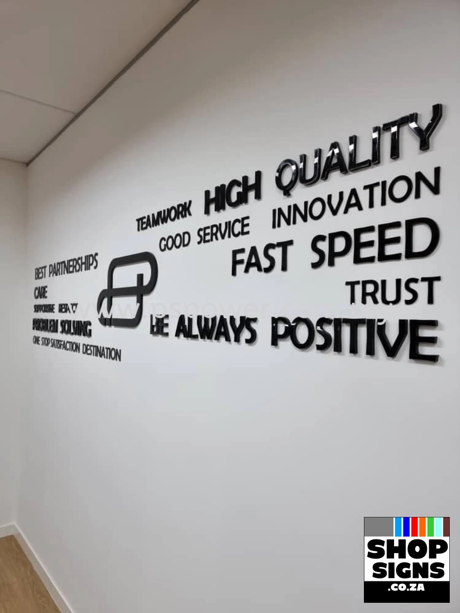

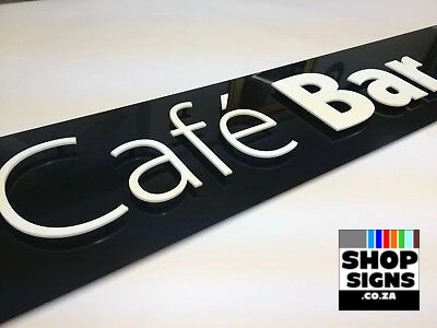
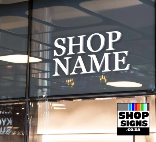
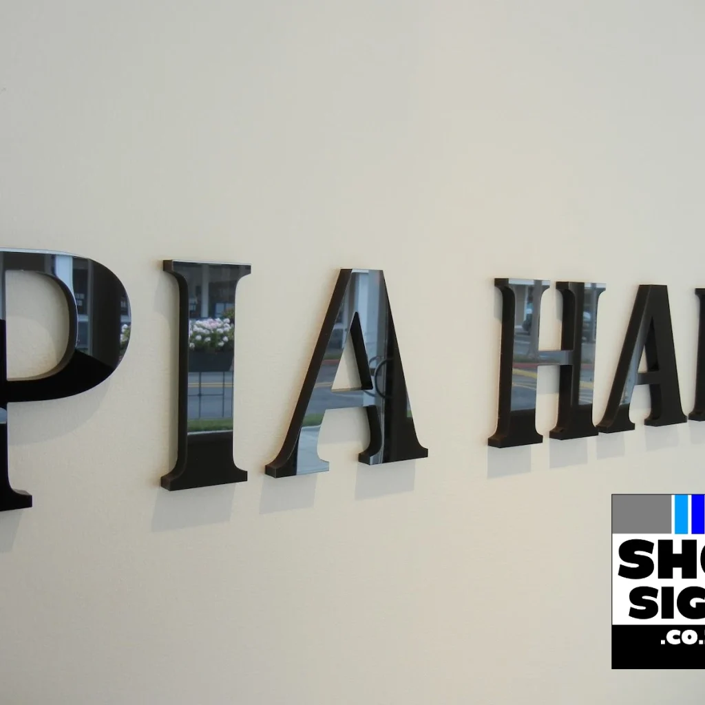
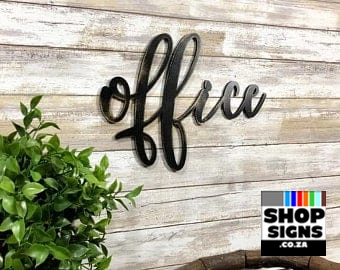
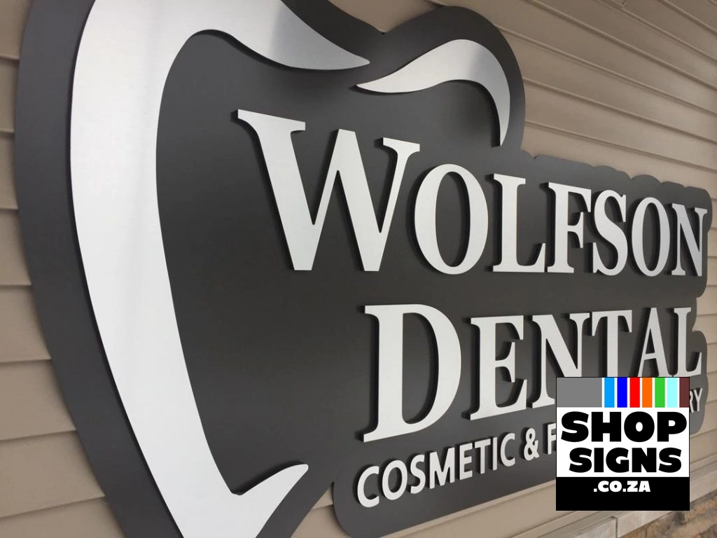
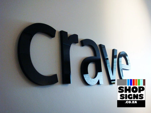
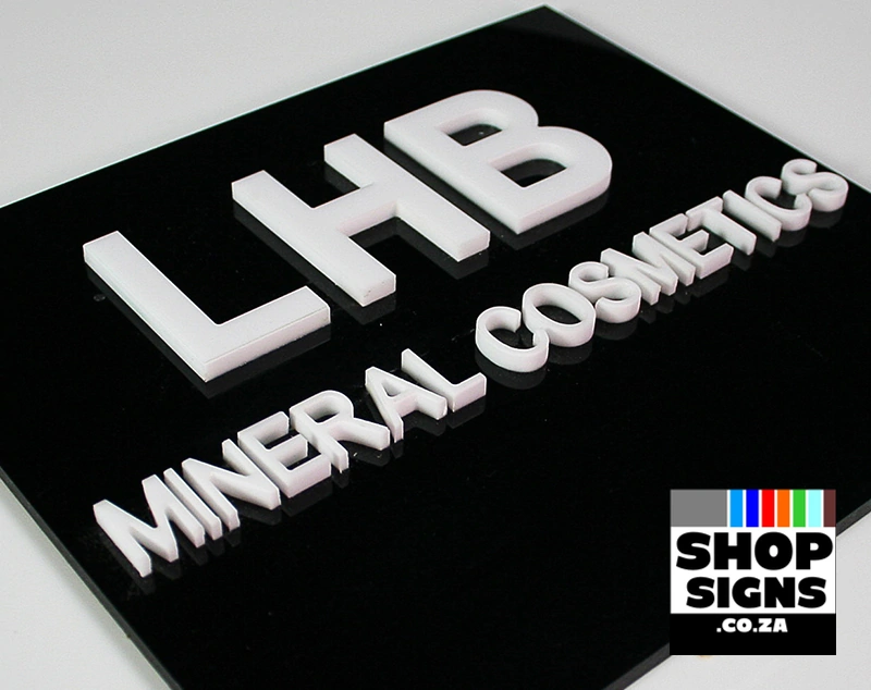
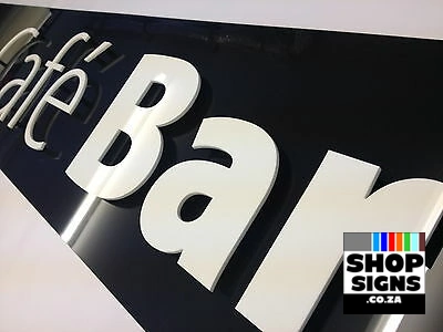
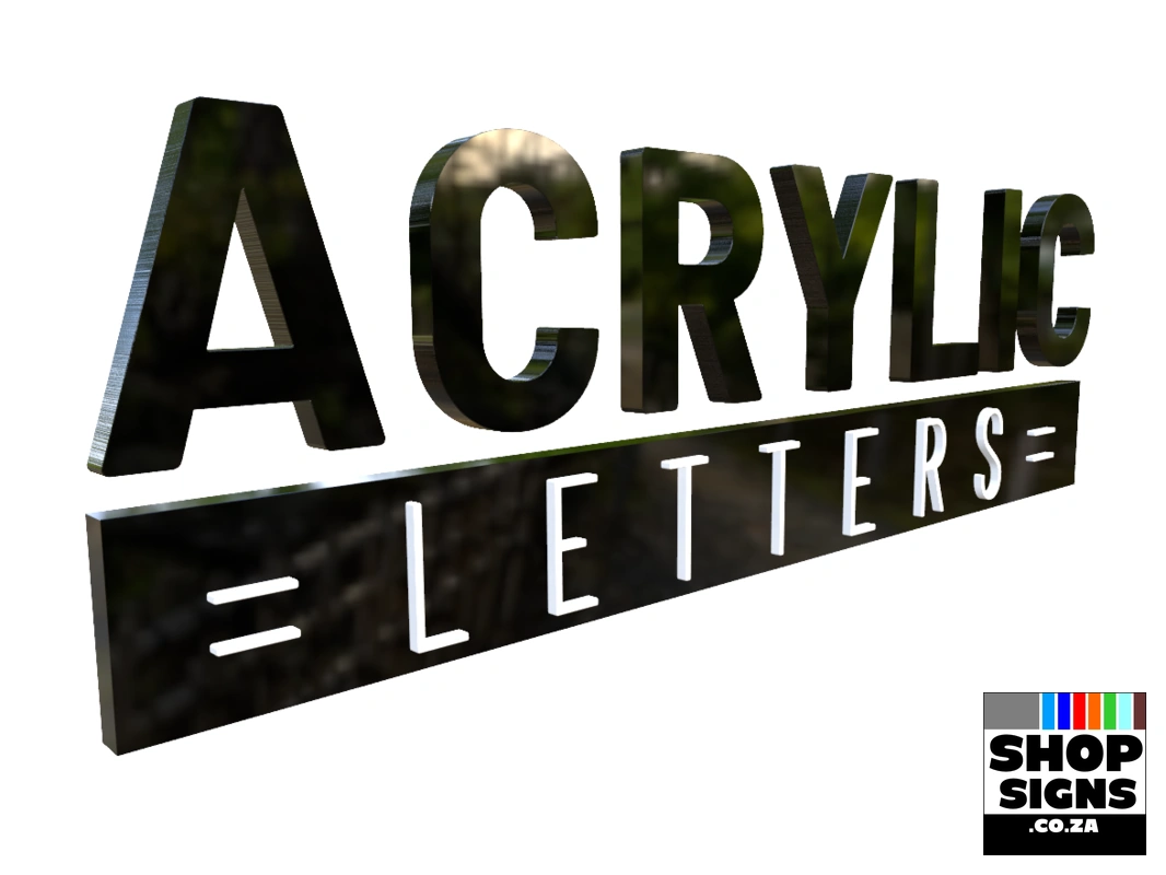
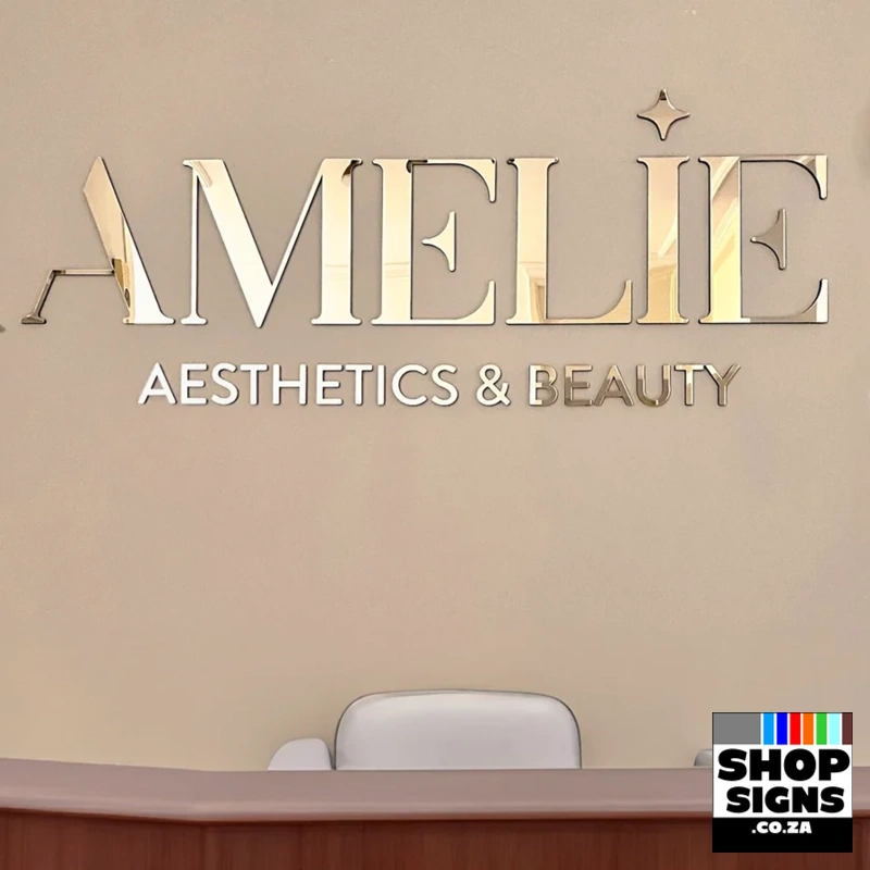
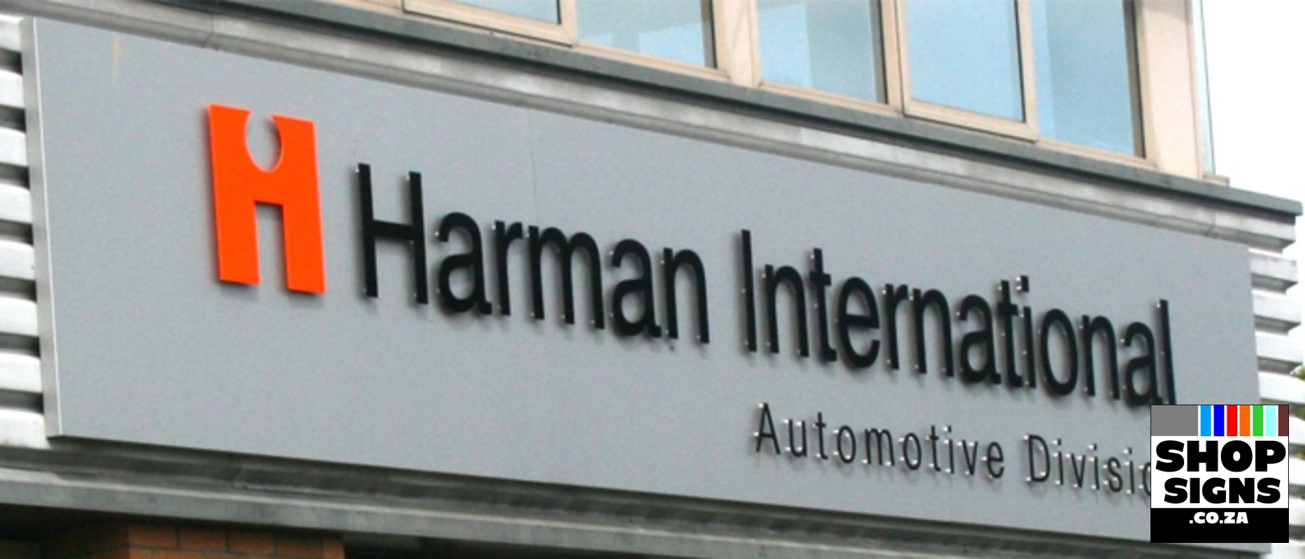
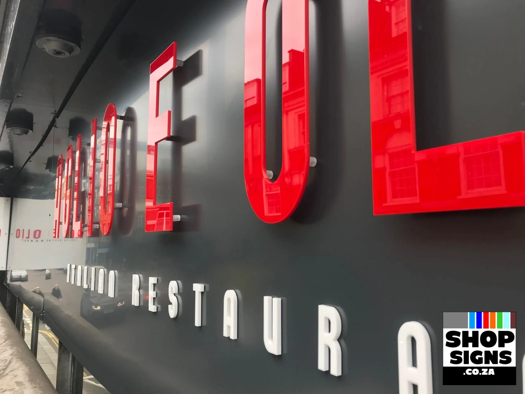
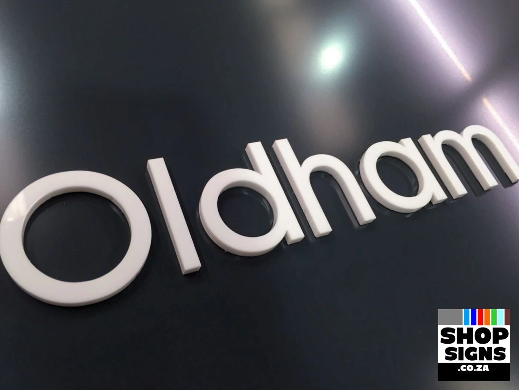
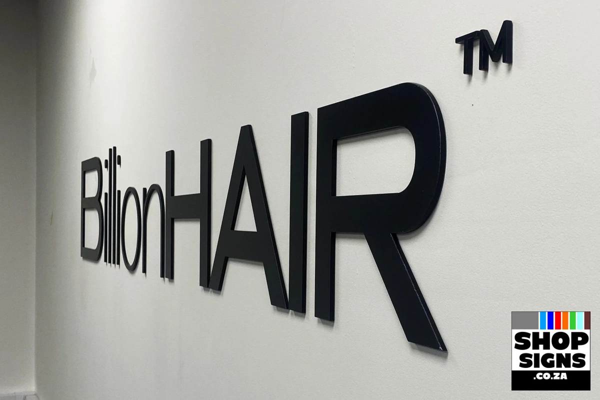
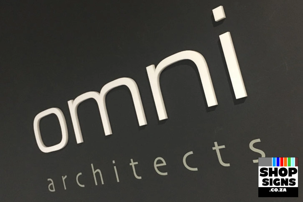
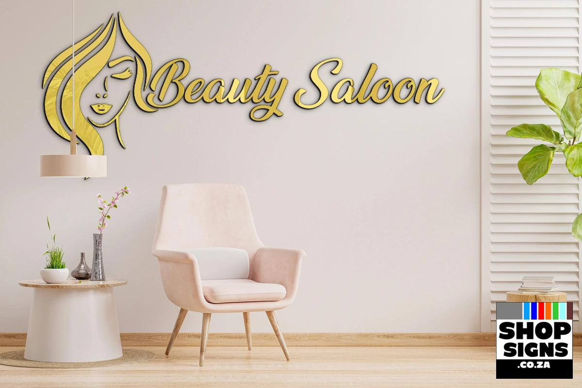
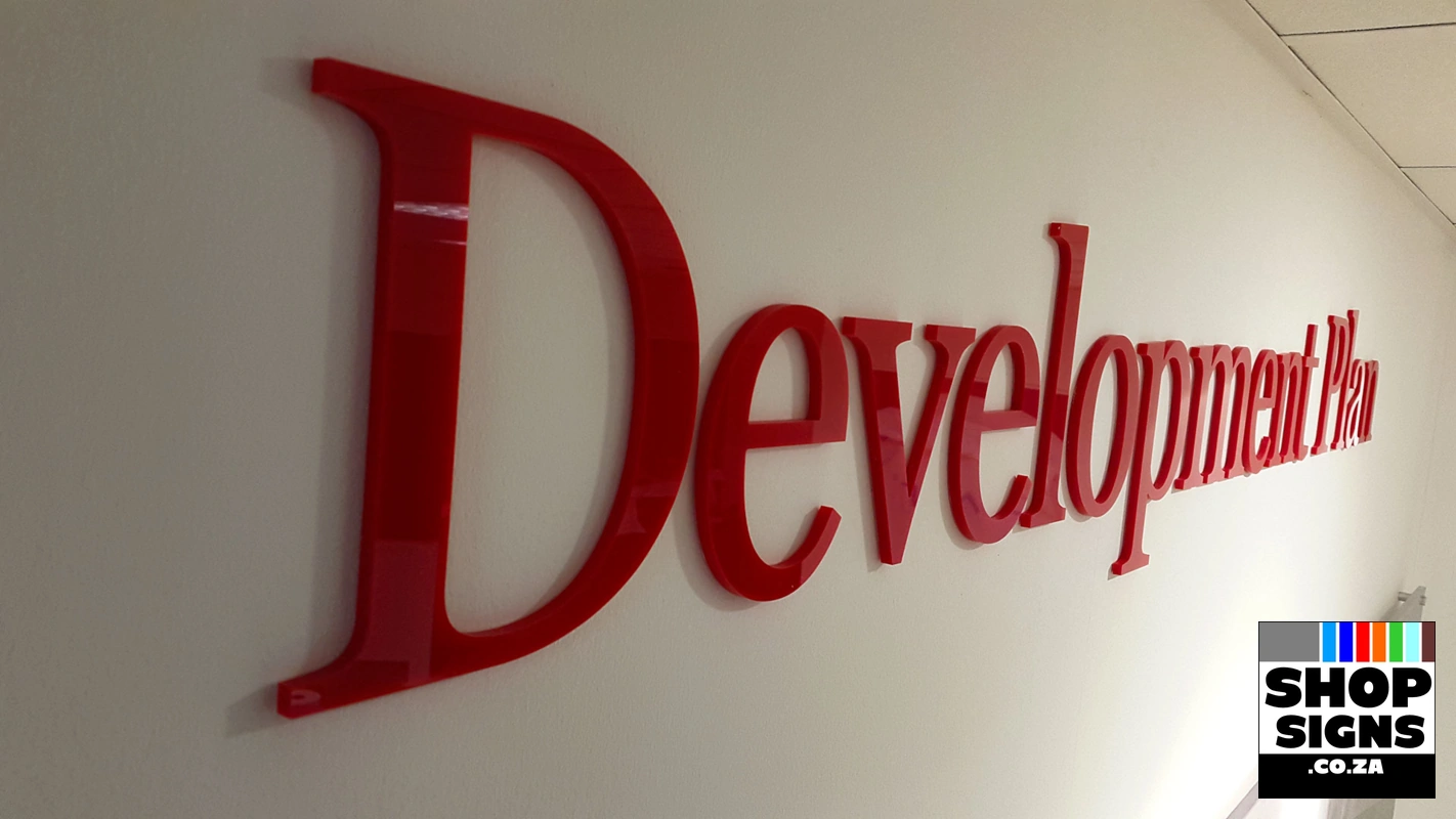
Acrylic Laser Cut Letters, Sign or Logo are ideal for creating a Luxurious Brand Image for your Shop Front in places like entertainment venues, offices, hospitals, retail stores, barber shops, beauty salons etc.

Installing Acrylic Letter Signs Guide
This guide will help you learn how to set up and install Acrylic Laser Cut Letters, Sign or Logo.
Let’s start our installation. It shouldn’t take you more than 10 minutes to achieve a perfect setup.
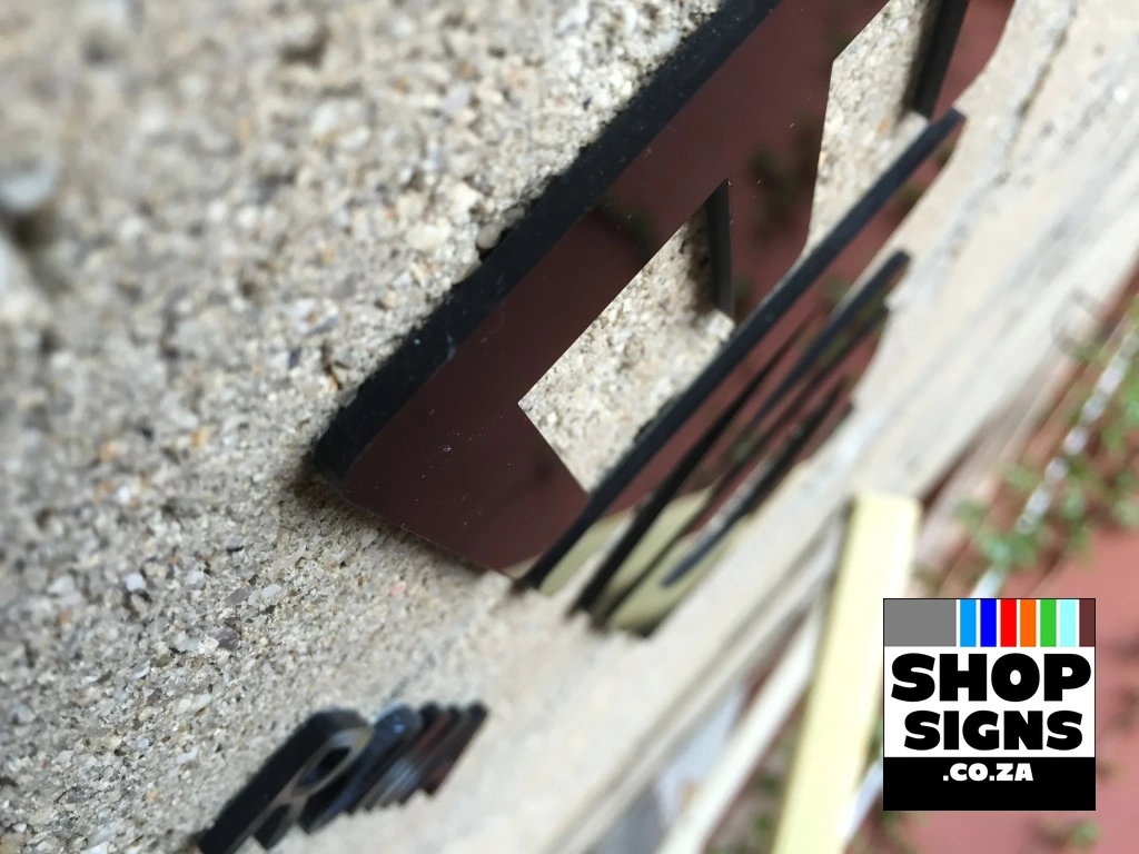
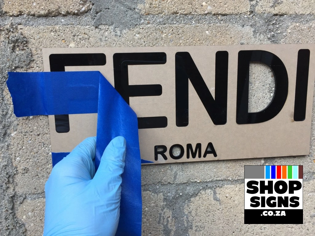
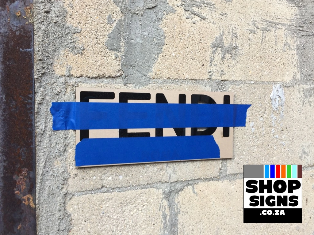
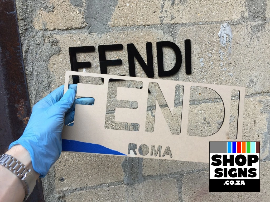
The first step in the installation is to clean the surface area where the sign will be, and place your Acrylic Laser Cut Letters, Sign or Logo with Masking Tape in the area where they will go. This will keep the letters in position and give you a visual preview before you permanently stick them to the wall or surface, with Double Sided Tape.
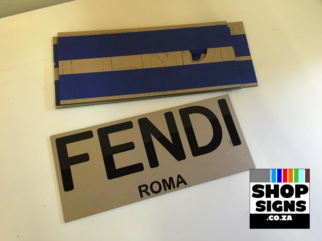
If you’re satisfied with the Acrylic Laser Cut Letters, Sign or Logo’s placement, flip the sign or laser cut acrylic letters over, and remove the protective layer from the sign or letters.
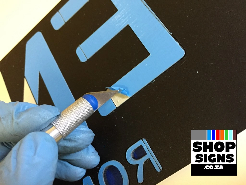
Once the protector is off, Apply Double Sided Tape and put letters in place.
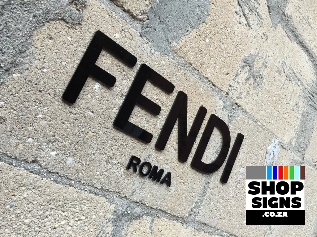
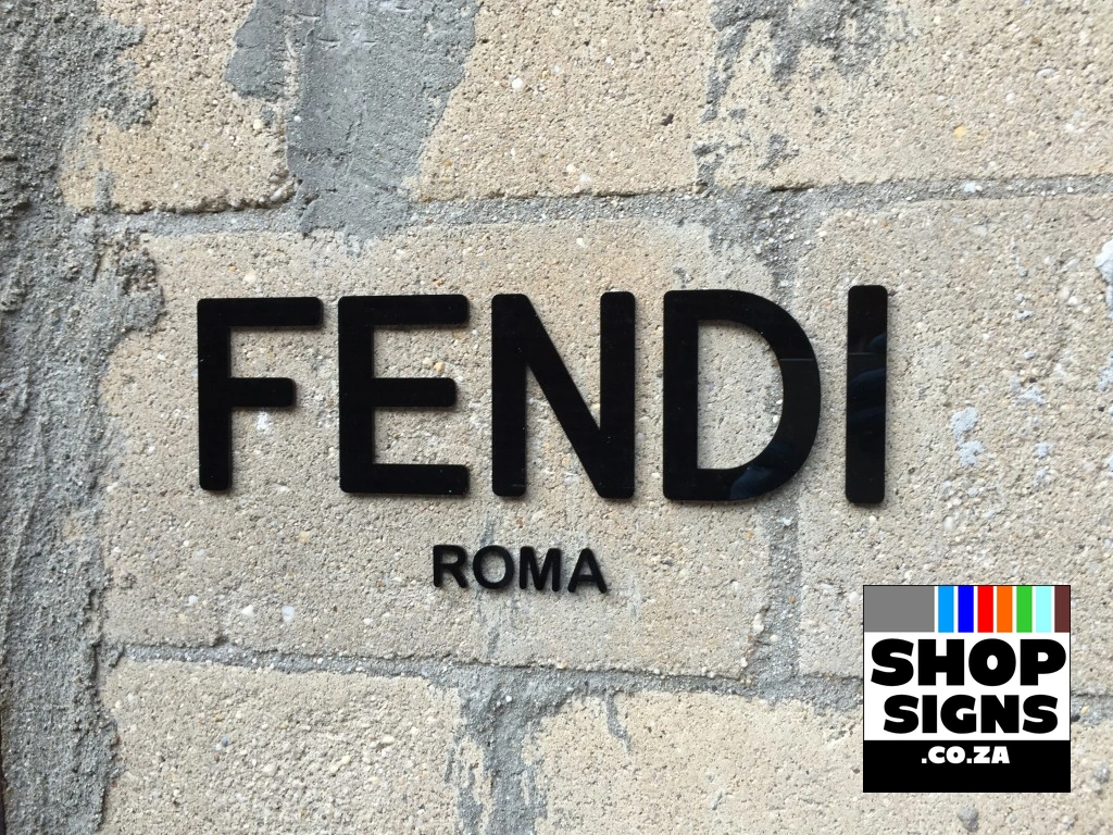
After putting all letters or sign in place, you can remove the protective layer in front of your Acrylic Laser Cut Letters, Sign or Logo.
The installation is done, and your Laser Cut Letters, Sign or Logo, is set to Attract New Customers.


There are different types of Double Sided Tape:
Industrial Double Side Tape – outdoor and indoor, very heavy bonding but it is thick, so it may be visible.
Regular Double Side Tape – good for indoor use, low bonding good for large items in terms if area and needs clean surface to attach too. Glass Surfaces – keep in mind that adhesive backing will be visible for other side of the glass so be sure your design address it or you gave ways to cover your adhesive backing on other side.
The best fonts for shop front signs prioritize readability and visibility from a distance, with popular choices being clean, bold, sans-serif typefaces like Helvetica, Futura, and Arial. The ideal font also aligns with your brand’s personality.
Recommended Fonts
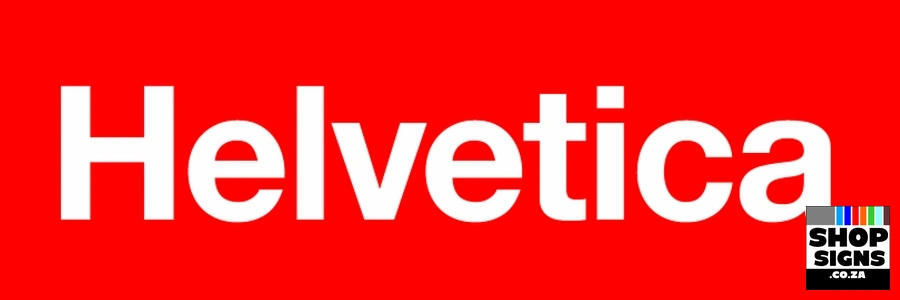
Helvetica: A highly popular and timeless sans-serif font known for its clean lines, balanced spacing, and excellent readability in various environments, from corporate offices to street signs.
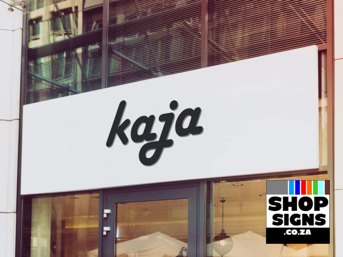
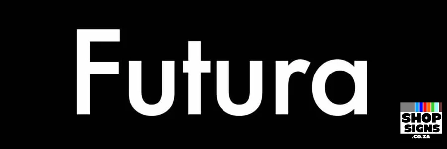
Futura: A modern, geometric sans-serif that is clean, versatile, and effective for contemporary branding and general signage. It works well at different scales and is easy to read at a glance.
Arial: Similar to Helvetica, Arial is a simple, highly readable sans-serif font widely used for signage due to its clarity and effectiveness for outdoor use.

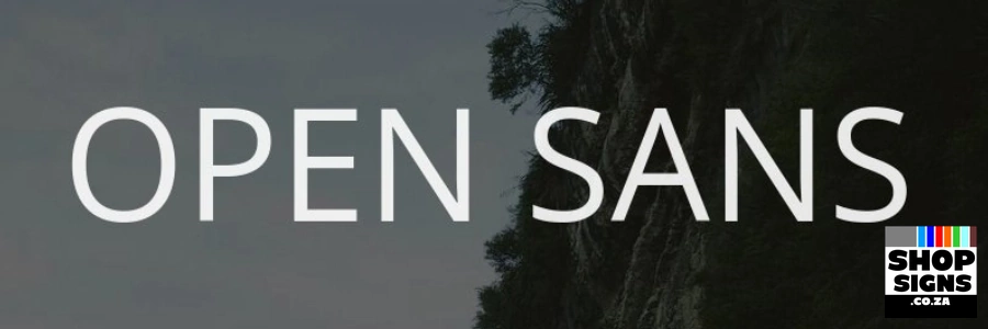
Open Sans: A humanist sans-serif optimized for screens and print, known for its open letterforms and high legibility, giving a friendly and approachable feel.
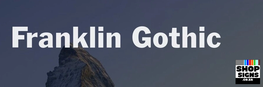
Franklin Gothic: A bold sans-serif that provides heft and impact, making it great for commanding attention with headlines and primary business names.
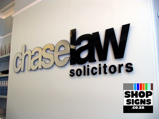
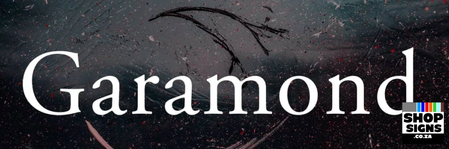
Garamond: A classic serif font (with small strokes at the ends of letters) that conveys tradition and professionalism. It is highly legible, particularly for smaller text areas or businesses aiming for a sophisticated, established image, such as law firms or bookstores.
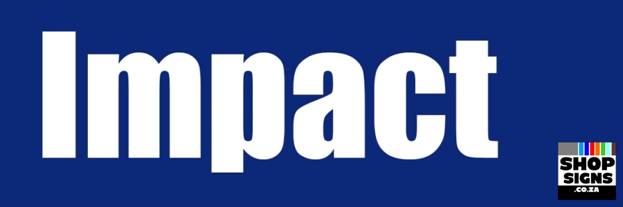
Impact: A heavy, condensed sans-serif with very thick strokes, designed to be impossible to ignore, which makes it ideal for sales, promotions, or short, urgent messages.
Key Selection Factors
Prioritize Legibility: The most crucial factor is that passersby can read your sign quickly and from a distance. Sans-serif fonts are generally superior for this purpose compared to more decorative styles.
Match Your Brand Personality: The font should reflect your business’s identity. A formal serif might suit a law office, while a modern sans-serif or a careful use of a script might work for a tech startup or a boutique, respectively.
Mind the Contrast and Color: Ensure high contrast between the font color and the background color (e.g., black on white or white on a dark color) for maximum visibility.
Limit Font Usage: Stick to one or, at most, two complementary fonts to avoid a cluttered or unprofessional appearance.
Consider Lighting and Materials: Thin or delicate fonts may disappear when cut into certain materials or when backlit. Bold, uniform thickness fonts often work better in varying lighting conditions. Avoid Problematic Fonts: Steer clear of fonts that are overly decorative, heavily script-based (unless used sparingly for a specific effect), or widely considered unprofessional, such as Comic Sans or Papyrus.
- Flat Laser Cut Letters For Developments
- Laser Cut Letters Acrylic Logo
- Laser Cut Letters Acrylic
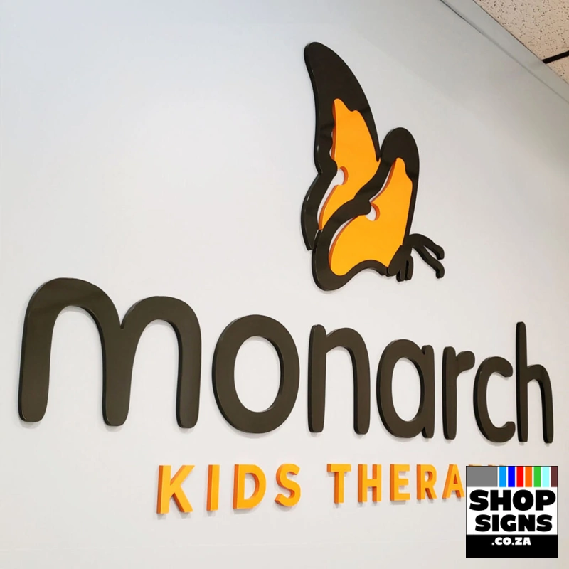
- Laser Cut Letters Beauty Saloon
- Laser Cut Letters Beauty Sign
- Laser Cut Letters Business
- Laser Cut Letters Hair Salon
- Laser Cut Letters Kids
- Laser Cut Letters Logos
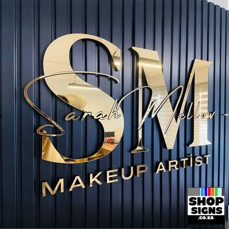
- Laser Cut Letters Makeup Artist
- Laser Cut Letters Sign Stand Off
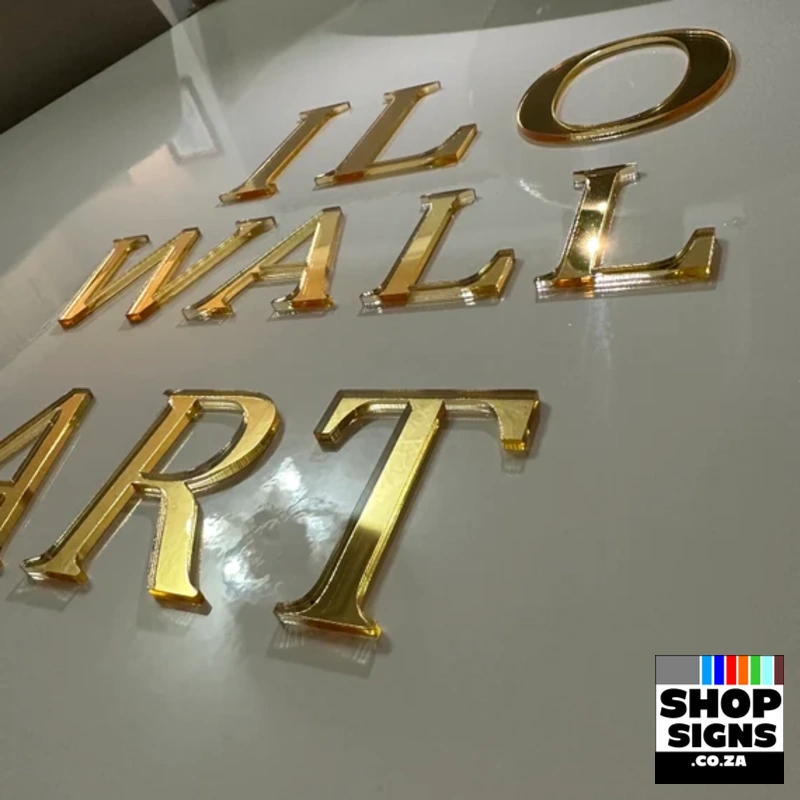
- Laser Cut Letters Wall Art
- Shop Sign Name Business Name Sign
- Shop Sign Names Barber Shop
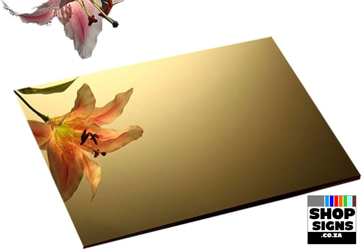

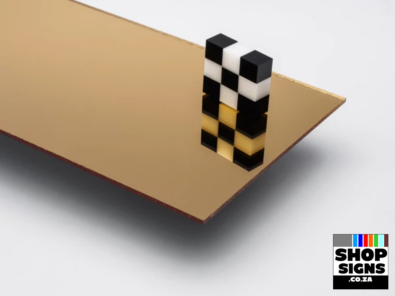


- Acrylic Mirror Gold 3mm
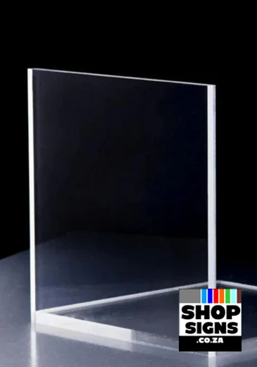
- Clear Acrylic 5mm
- MDF Wood Board 6mm
- Mirror Gold Acrylic 3mm
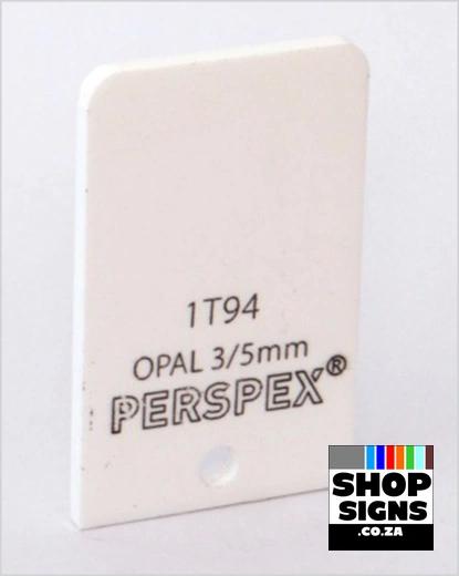
- STANDARD 1T94 Opal White 3mm
- STANDARD 1T94 Opal White 5mm
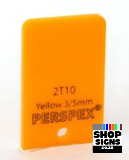
- STANDARD 2T10 Yellow 3mm
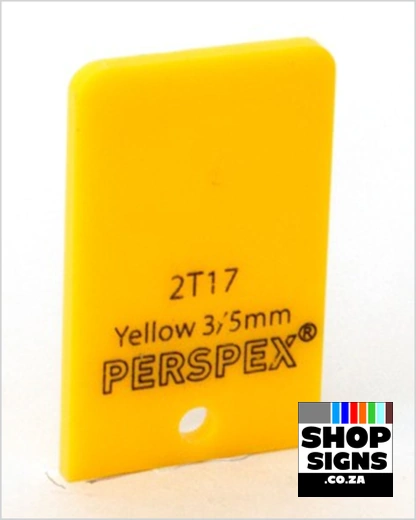
- STANDARD 2T17 Yellow 3mm
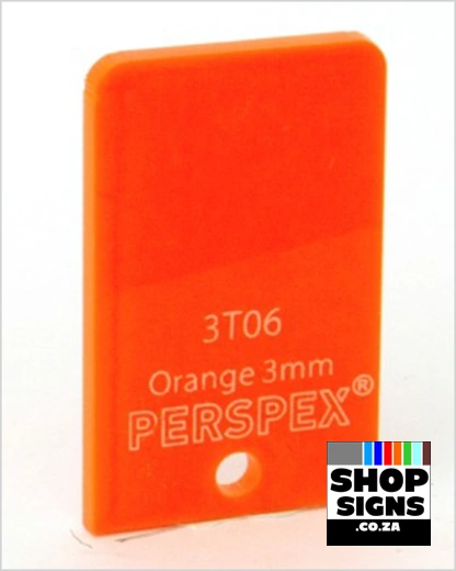
- STANDARD 3T06 Orange 3mm
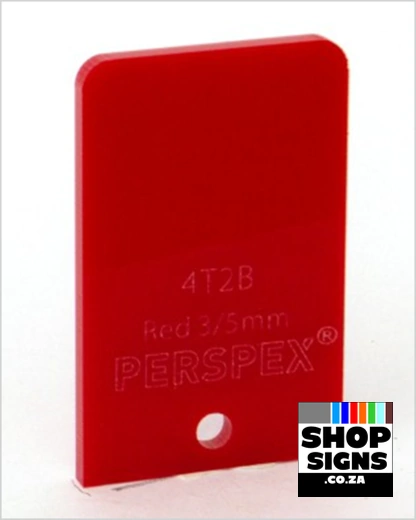
- STANDARD 4T2B Red 3mm
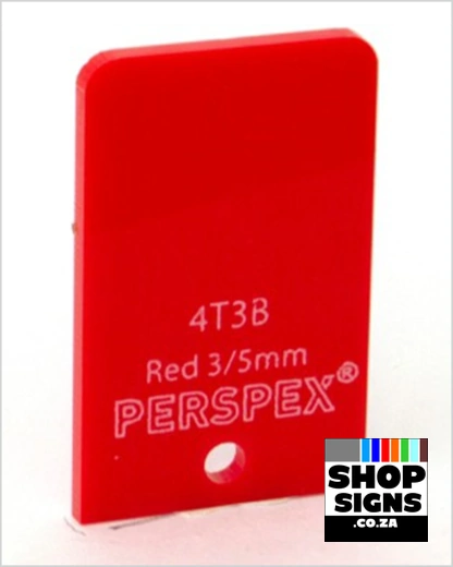
- STANDARD 4T3B Red 3mm
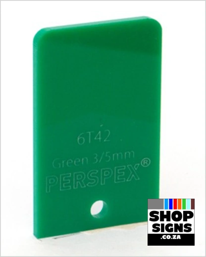
- STANDARD 6T42 Green 3mm
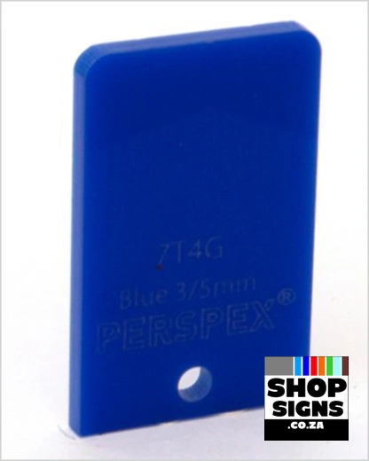
- STANDARD 7T4G Blue 3mm
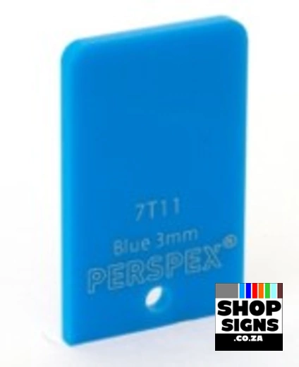
- STANDARD 7T11 Blue 3mm
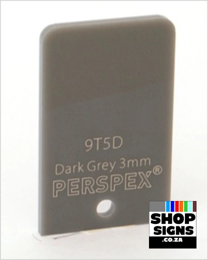
- STANDARD 9T5D Dark Grey 3mm
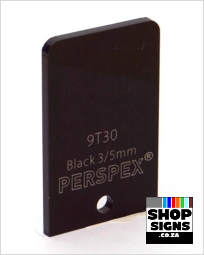
- STANDARD 9T30 Black 3mm
- STANDARD 9T30 Black 5mm
MDF Wooden Names can be Painted ANY Color. Various Colors and Options Available at your Local Hardware Store. We can Highly Recommend Tjoko Paint for MDF Wood Laser Cut Names, Letters and Words.